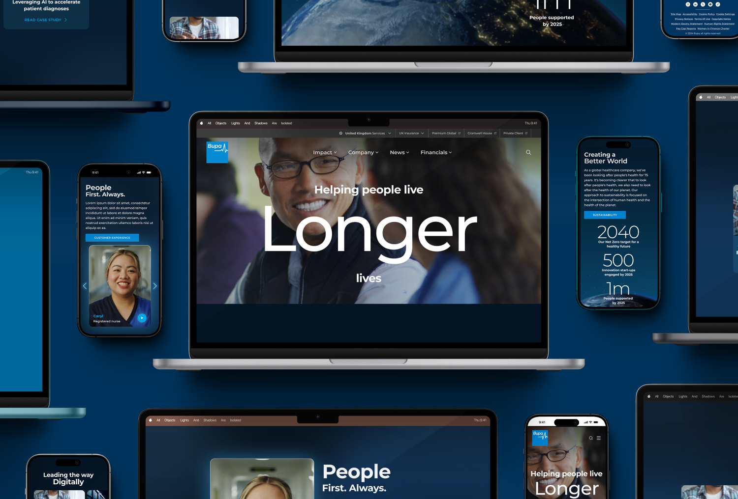
Bupa Group is a global healthcare company that offers health insurance, hospitals, dental services, and aged care. Operating in countries across Europe, Australia, Latin America, and Asia, Bupa reinvests its profits into healthcare services to support healthier lives.
Bupa
Project overview
The purpose of the website is to create a new digital experience that emphasizes the core values of people care, sustainability, and innovation. This project was designed to showcase the group’s commitment to these principles through an intuitive and engaging platform, enhancing user interaction while reflecting the organization’s mission.
Project team
Chief Creative Officer: Ferdi Wieling
Director of Strategy: Maharaj Varatharajah
Creative Director: Joe Lygoe
Design Lead: John Lloyd
Senior UX UI designer: Nicolli Mognon
UI designer: Samir Chauhan
Senior Brand Strategist: Will Welsby
Activities
Research, information architecture, TOV development, UI design, design system.
My role in the project involved developing and implementing the design system, ensuring consistency across the digital experience. I collaborated with cross-functional teams to create reusable UI components, establish design guidelines, and streamline workflows.
Duration: Feb – May 2024
Challenges
- As the timeline was reduced to launch the site in line with the company’s largest campaign this year. We introduced fast paced iterative work flow to the design and development phase. This allowed us to receive client approvals quicker and minimise risk during the development period.
- Short timeframe between site launch and campaign messaging updates, which created extra time pressure, as we needed to provide early CMS training and support.
- Client requesting changes to the Design System during the development phase, which impacted the delivery plan, but we still managed to stay focused and go live as planned.


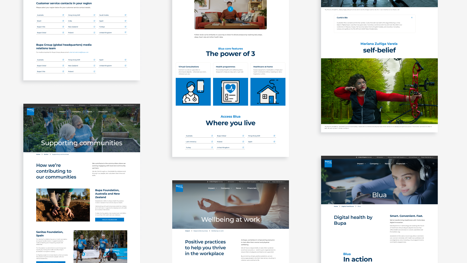
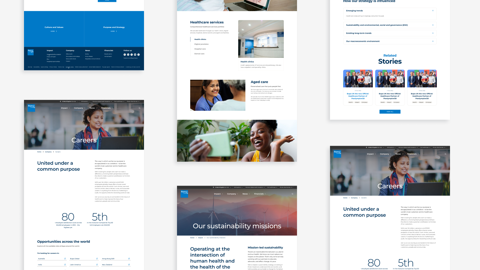
Page designs
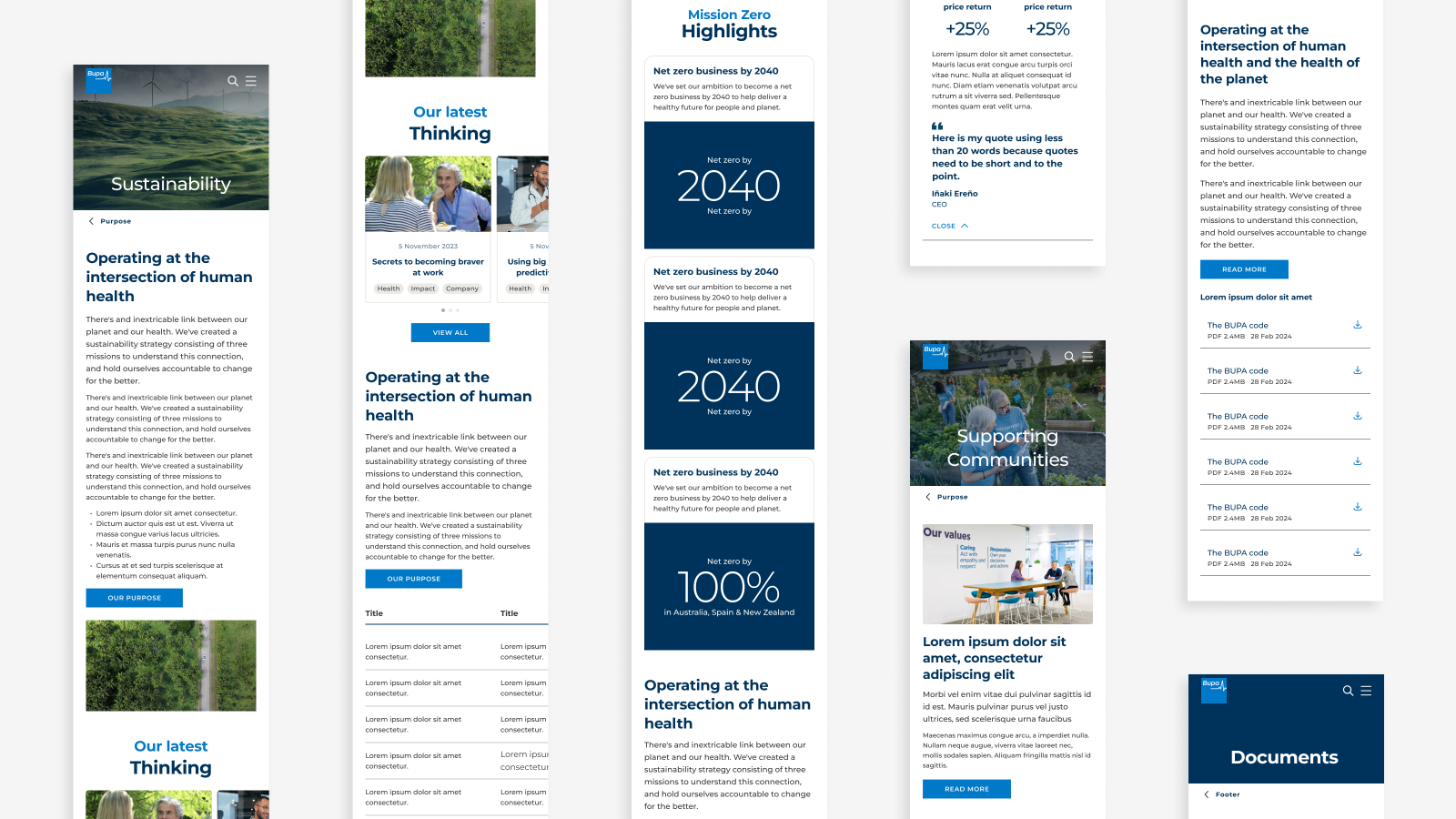
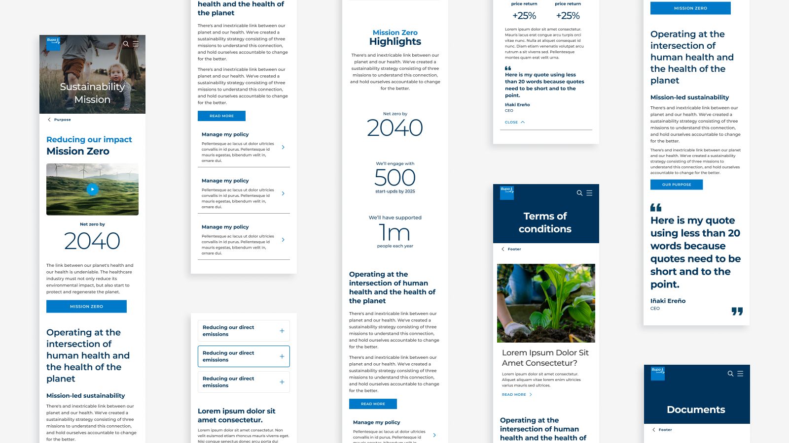
Mobile designs
Utility bar
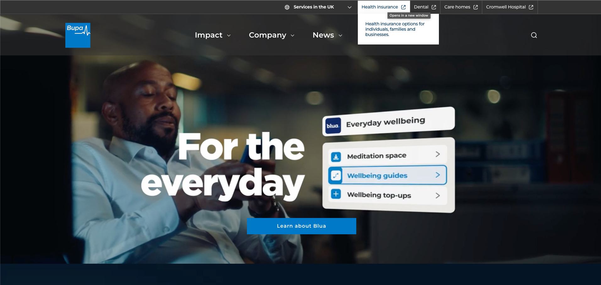
The utility bar was redesigned to improve navigation after many visitors to Bupa.com mistakenly believed they were on the consumer site, leading to confusion and abandonment. The previous bar failed to redirect users effectively and took up too much screen space. The new design offers geolocation-based “quick links” to commonly searched services, simplifying navigation and enhancing the user experience.
Bupa

-
Date
May 22, 2024
-
Client
Bupa
Share project
