Scroll to top

Case Study Espaço Ativa.Mente

Project Overview

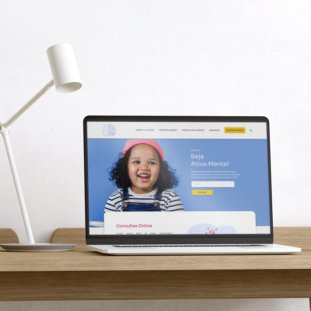
Espaço Ativa.Mente is an integrated care clinic* that offers humanized care and seeks to provide a better quality of life for its patients.

The company started in 2020 and since then has offered affordable services to children and adolescents in different treatments. It also offers services for other companies, as well as a system of partnerships with plans and discounts.

In summary, by creating the website, the company will be able to create a digital presence, allow users to book appointments online, meet professionals, and have access to a support platform.

Integrated care is an organising principle for care delivery with the aim of achieving improved patient care through better coordination of services provided.

The Problem

The company requires a website and a visual identity as well, as it is really difficult to find them on social networks and digital search engines, making it difficult to access and analyze company data.

Secondly, the clinic has problems with the booking system, due to the fact that it is difficult to organize the bookings that arrive by phone, WhatsApp and through direct contact with the specialist social networks.

Activities

UX Designer leading the Espaço Ativa.Mente project.

Desk research, user flow, wireframes, visual design, prototype and testing.

October 2021 – February 2022

The goal

Understand how users hire the service of an integrated care clinic, in order to improve their experience and explore new business opportunities.

Bring digital visibility to the clinic, its services, and how to hire it.

186

Understanding the business

As the company did not have much data, therefore we couldn’t have a full understanding of the business. Consequently, it was necessary to do an accurate research and moreover, it was required, a consultancy for the structuring of the business.

During the first part of the research, it was sought to understand more about the business, market positioning and analyze competitors.

Initially, desk research was conducted in order to analyze the market and adjacent trends, particularly, it focus to understand how other companies and competitors were positioning themselves and interacting with their users.

As a result, it was noted how the digital presence has strengthened in recent months, part of this presence is aligned with the effects of the pandemic on mental health and child development.

Overall, an increase in demand for online services was also observed, since many users still face difficulties to be present in person consultation.

A preliminary analysis of the business was carried out using the Plus/Delta analysis. For instance, products, processes and services were examined.

The result of this process identified some problems in business strategies. The company does not have a channel where its audience can access information about the clinic and its services.

It was clarified the importance of investing in branding through a visual identity and marketing plan for the growth of the company.

Further, a competitor analysis was conducted to determine how the business is performing compared with other companies.

Five direct and indirect competitors were selected, where several business topics were analyzed, among the main ones:
website, online consultations, multidisciplinary services offered, social media and branding.

Competitor Analysis

The result of this analysis was that most competitors have a synergy between a consistent websites and their visual identity to reinforce their digital presence on social networks.

  • Four out of five competitors offer an online booking features, two of them with interactive calendars that allow users to view available dates.
  • Four out of five competitors also offer the online consultation service, being able to reach customers from other locations, offering more convenience and choice for their customers. But only two have a video call system integrated into the platform.
  • Most of the competitors analyzed offer two to three different types of services, only two offer the same services as the Ativa.Mente clinic.

The SWOT analysis was used in order to identify the main pain points, indicating them as topics of attention as well as strengths that could be used as insights into opportunities to be explored.

The biggest pains raised were:

  • Lack of partnerships, membership system and discounts.
  • Many patients are loyal to the practitioner, not the clinic.
  • Absence of its own booking system and patients management.
  • Difficulty in frequent activity on the clinic’s social networks.

The biggest advantages we have seen:

  • The opportunity to explore online services.
  • Qualified practitioners.
  • Creation of a supportive community between parents and experts.
Captura de Tela 2022-03-25 às 22.58.24

User-Centered Design Canvas

After collecting information during the research, it was important to organize and structure the data found. Consequently, it was proposed to present a workshop using the User Centered Design Canvas, thus it would help to understand the target audience, its value proposition, its main activities, strategic partnerships.

This activity aims to innovate, enable debate and create understanding between the user and the business.

User-Centered-Design-Canvas-Template-01

Understanding the user

To move further on the user stage, we create a hypotheses that guide our user discovery. They are:

  • Users hire the clinic through referrals from others.
  • Users know the clinic through friends and relatives.
  • Creating a website will assist the users to find a specialist and book a consultation, that could help in their problems.

Survey

Secondly, a Survey was conceived, which focused to understand why people seek treatment in a integrated clinic and how they seek these services.

As a result, many users share that they got to know the company through specialist who work at the company or through referrals from family and friends. Moreover, users claim to like humanized care and practitioners.

In addition, the respondent users confirmed that booking management could be improved, accordingly with the overcrowded reception.

Here are some of the questions we asked:

  1. How did you find out about Ativa.Mente?
  2. How long have you been an Ativa.Mente patient?
  3. What reasons led you to choose Ativa.Mente?
  4. For any reason, have you ever had to stop or thought about stopping your treatment at the clinic? And if you feel comfortable, could you tell us why?
  5. Do you have any suggestions for improvement for the clinic? Or some service that you find interesting to have? Or some change in the clinic environment?

In the course of our in-depth study, we interviewed three users in order to better understand their routines, their backgrounds, their problems, and their needs.

Scope of the interview:

USER BEHAVIOR | USER FEEDBACK | COMPETITOR

  1. What is your day-to-day context like?
  2. Why did you start treatment at Espaço Ativa.Mente?
  3. Have you (or your child) been treated at another clinic or privately?
  4. What is most important for you to hire a service?
  5. How did you feel when you used Ativa.Mente’s services?
  6. What is the most difficult part about treatment?
  7. Tell me what you like and one thing you don’t like in the Ativa.Mente.
  8. Describe any issues with the company during your treatment (your child’s treatment)? If yes, how did the company support you?
  9. Tell me what you think of the structure, of the environment and of the time of consultations in Ativa.Mente.
  10. If today you needed to stop therapy, for any emotional, physical, psychological or economic issue. What would be the reason?
Entrevista com os usuários

It was noted that users in general are busy, middle-class women who are dedicated to helping their children’s development.

Some interesting points:

  • Users pointed out the clinic consultation flexibility and easy access to the customer service (via whatsapp) were positive points that were often mentioned during the interviews.
  • The users stated that “reviews” are extremely important for hiring a service.
  • Users report that the most difficult part of the treatment is the financial, however the positive result in the treatment make them continue.

To show that, the information below was collected during interviews, survey and google review:

``I got to know the clinic through the speech therapist Camila, but I never found much information about the clinic, I hired the service because of the cousin referral.``

Insecure user due to lack of communication channels

``Sometimes, as a mother of an autistic child, I feel very alone... I have difficulty dealing with my child's condition, I wish I had more support for it.``

Frustrated user for not being able to help his son

'The clinic is great, but the value is heavy on our budget, I feel that the financial part is the only thing that might make me stop treatment.``

The user crestfallen for not knowing if he will be able to continue the treatment

``I thought it was a psychological clinic, I didn't know the other services and professionals.``

The user is interested in knowing other services

Define

After the research phase, two personas were created in order to illustrate the needs, frustrations and goals of users within the product.

Personas-01
Personas-02

User Journey

It was decided to use the Customer Journey tool to understand the user’s problems from the search stage to contracting the service. In order to, find opportunities to address customer pain points, alleviate and ultimately create a better experience for users.

Opportunities found:

  • Invest in marketing, partnerships with schools;
  • Create a website that gives visibility to the services.
  • Online Booking; Give visibility to the contact channels.
  • Give visibility to the plans, membership and discounts.
  • Add users testimonials;
  • Referral system discounts;
  • Support community.
user_journey-ativa_mente

Architecture

In order to organize the content of the product, a site map was required. A card sorting activity was conducted to help in this process. In this stage, we observed that the user felt confused due to ambiguity with some of the terms used in the navigation.

Cardsorting
Site Map-01
Site Map-02

Insights

Finally, the grouping phase of the collected insights was entered. Certainly not everything that was identified could be solved. Therefore, the MSCOW tool was used to prioritize and resulted in this main topics: specialties, clinic, partnerships, contact, online booking and payments.

In conclusion, the one that stood out the most was the online booking, as it is the greatest functionality of the site.

Some points listed after the dynamic, were transformed into a list of items to be improved and hypotheses that were confirmed, they are:

  1. Give visibility to the services, specialist and clinic.
  2. Improve the consultation booking experience, where the user receives notifications from the company.
  3. Advertise pricing, discounts and memberships available easily and transparently.
  4. Add testimonials to strengthen the community and make users feel confident in hiring the service.
  5. Creation of a portal aimed at the parents’ community.

Starting the design

Rebranding

During the initial meetings, the business outlined the desire to redesign its visual identity, since it was not satisfied with the current one. In addition to, several versions of the logo were also used, which hindered the consolidation of the brand.

Thereby, attributes such as contrast, alignment, typography, colors, harmony and legibility were considered for the creation of this new identity.

In brief some of the client’s requirements:

  • Keep the colors that made up the first version of the identity: Blue, pink, purple.
  • Keep the brain symbol.
  • Keep the name.
logo_antes
logo_depois

Wireframes

In the following step, low/medium fidelity wireframes were produced and a test was conducted with users to validate the designs.

wireframe1
wireframe_3
28

Usability Testing

During the usability test it was possible to identify points that needs to be improved. To identify them, three tasks were proposed that users should perform, they were:

Study type: Moderated usability test

Location: Remote

Participants: 5 participants

Lenght: 25 minute average

Task1-1
Task1-2
Task2-1
Task2-2
Task3-1
Task3-2

Here some of the users feedbacks:

``I love the calendar idea, but I can't see what dates are available.``

User indicated some points where status visibility was not clear

``I liked the layout, but it has a lot of textual information, I find it easier with symbols/images.``

User prefers more synthesized content, organized by icons.

``I found it easy to find WhatsApp number, but I didn't understand that it was a button, maybe if it was green``

User did not understand that the button directs to WhatsApp

`` ``Book an appointment`` got a little long, I need to scroll a lot.``

User points out that ``book an appointment`` could have a better experience

Refining the design

As a result of the data collected in the usability test, some features and layout have been improved.

Users found the booking form too long, due to the number of items and poor distribution of information. In addition, they commented on the colors used in the calendar, that they did not understand which days were available.

The booking form was reformulated, leaving personal data and calendar first, followed by professional selection and consultation information.

In addition, different system statuses were created for the calendar, differentiating the available dates and times from the unavailable ones.

Agendamento Generico

On the contact page, users did not find the button that linked to WhatsApp, as a consequence, some adjustments to the page layout such as left alignment and increasing the visibility of the WhatsApp button.

Contato_antesedepois

Dynamics of UX writing were also used to contribute to the user experience and assist in the understanding and reception of these users.

Take aways

Impact

In conclusion, it was observed how users reacted positively to the website and the features present in it. Furthermore, it was possible to perceive a great impact of the research on new business strategies, as well as another look at its brand and its effects.

Through the UX process, many users discovered other services offered by the clinic. Moreover, the audience were unaware of other practitioners and payment methods, such as discounts and memberships.

For instance, some users expressed interest in Portal Ativa.Mente and indicated that they would access the portal and that they wanted to be part of a parent’s community.

What I've Learned

Much was possible to learn in this project. I had the opportunity to work with a company that, even though small, is really concerned about its users. Therefore, they opened the doors for me to contribute in some way, which I am totally grateful.

Besides, I learned that companies have their limitations, which affect a project/product as a whole. Thus, the prioritization process helps to understand which functionality matches the user needs.

5400479
UI design UX design

Case Study Espaço Ativa.Mente

  • Date

    February 16, 2022

  • Skills

    UX, UI, Product Design, Prototype, Usability Test

  • Client

    Espaço Ativa.Mente

Share project

Post a Comment

Your email address will not be published. Required fields are marked *