Scroll to top

Logicor: Property Map

Project overview

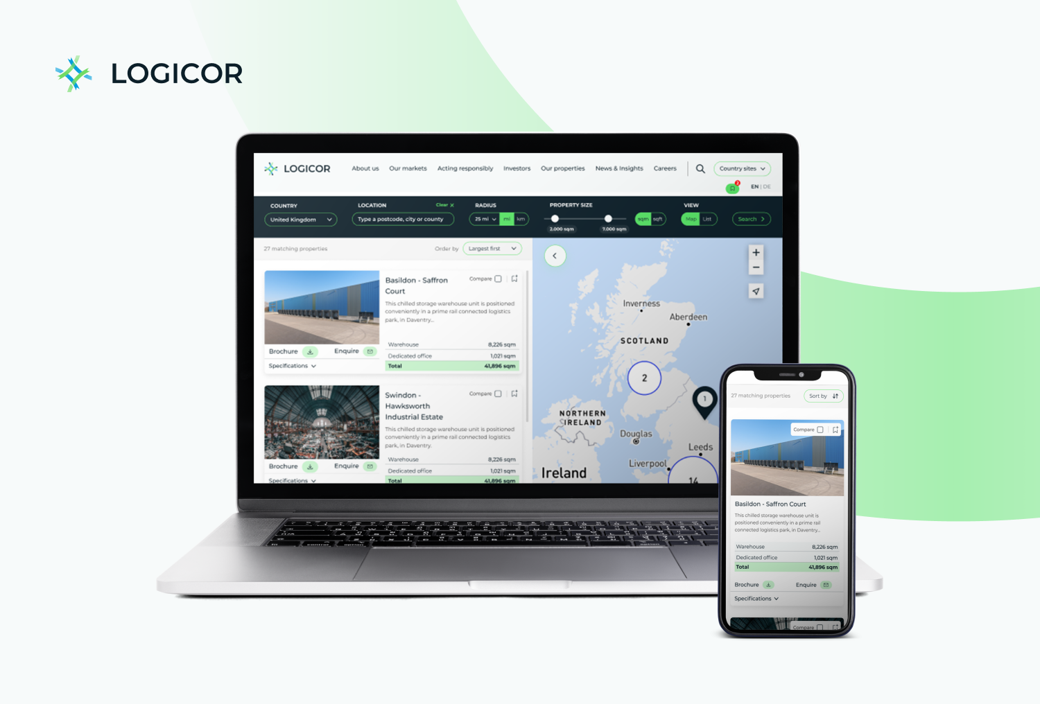
Logicor engaged with the team to redesign its website and create a cohesive digital experience that integrates various communication channels, including careers, investor relations, and property maps. Partnering with a third-party agency responsible for property search management, the primary objective was to enhance the user experience by improving the usability of the tools, streamlining access to essential information, and unifying data across the property portfolio.

Project team

Creative Director: Simon Gittings

Technical Consultant: Jude Martin​

Senior UX UI designer: Nicolli Mognon

UI designer: Samir Chauhan

Senior Brand Strategist​: Will Welsby​

Activities

Desk research, user flow, information architecture, wireframes, reskin, prototype, testing.

Duration: June – October 2023

Problem identification

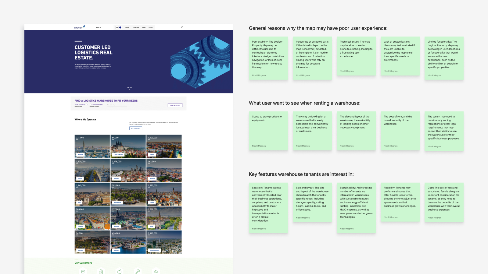
The initial phase involved identifying the most relevant information for users. To achieve this, the team conducted interviews with estate agents and account managers, who serve as the primary points of communication, to explore users’ pain points. It was discovered that many users had difficulty accessing basic information, as it was often hidden within property brochures. Additionally, users expressed a desire for access to various media types, such as videos, images, satellite views, and blueprints, to aid in their decision-making process.

Logicor - Property map 7

The approach

To address these challenges, the team implemented a streamlined approach that made essential property information more accessible. They reorganized the content structure, ensuring that key details were prominently displayed rather than buried within brochures. Additionally, the website was enhanced to support multiple media formats, allowing users to easily view videos, images, satellite views, and blueprints when available. These changes provided a more comprehensive and intuitive user experience, empowering users to make informed decisions with greater ease.

Logicor - Property map 6

Improvements

Search

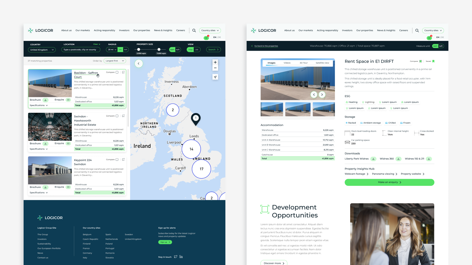
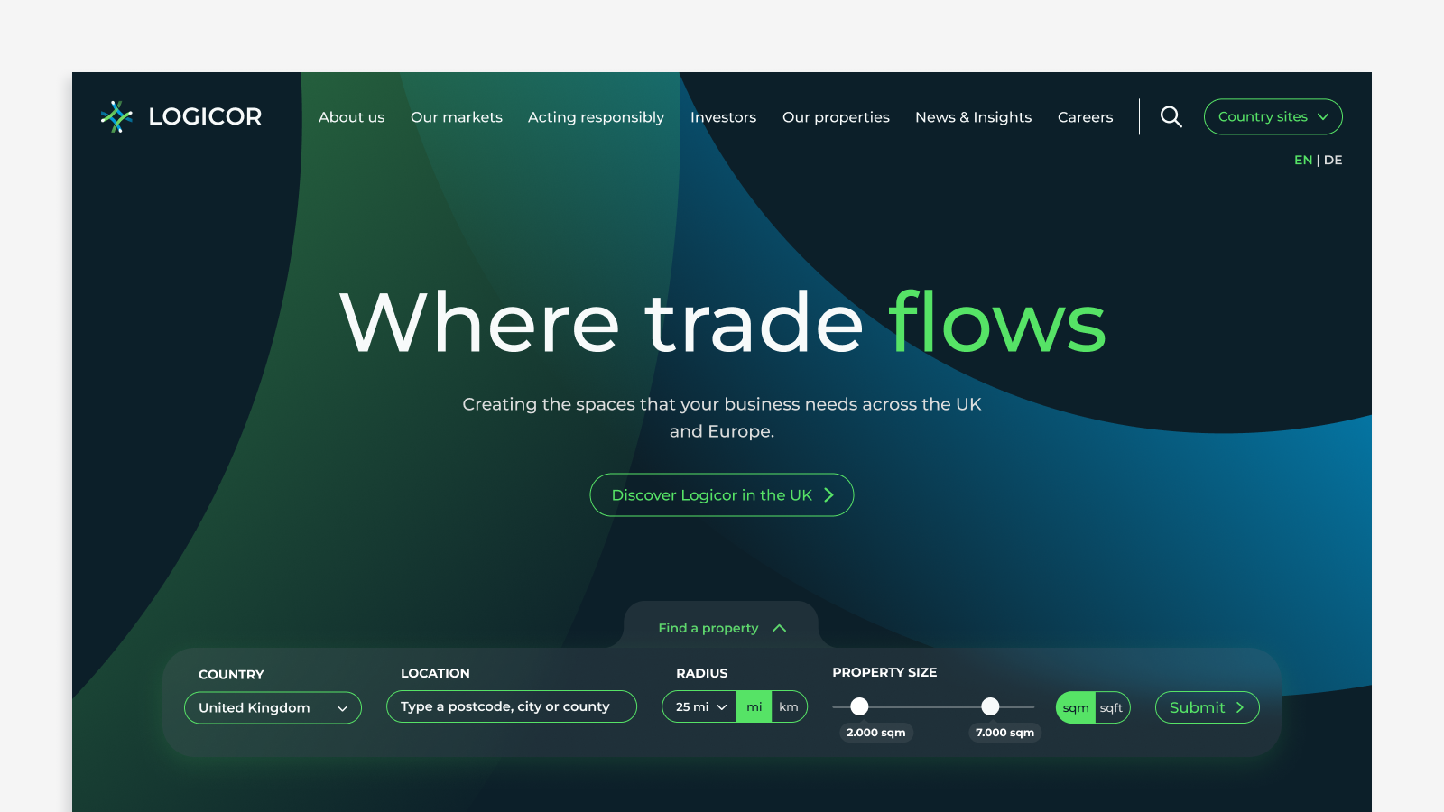
The existing search engine was inaccurate and sometimes confusing for users. Logicor required a tool that allowed users to filter properties not only by geographic location but also by criteria such as size, building type, and availability. As a company serving a European-based market, Logicor needed the search tool to accommodate different measurement systems, allowing users to switch between feet and metric units. Additionally, to explore future business opportunities, the company wanted users to have the option to view properties still in development, ensuring ongoing engagement once those properties were completed.

User flows

The team refined the user journeys to enhance engagement and boost conversions on the website. This involved strategically placing the property search feature in key areas and showcasing available properties more prominently. These changes significantly impacted lead generation and conversion rates, creating a more seamless and effective experience for users.

Featured properties

The team also proposed new business opportunities for Logicor’s business developers by introducing a feature where select properties could be prominently showcased on the site. These featured properties received double the detail views compared to standard listings, providing greater visibility and enhancing potential business opportunities.

Property details page

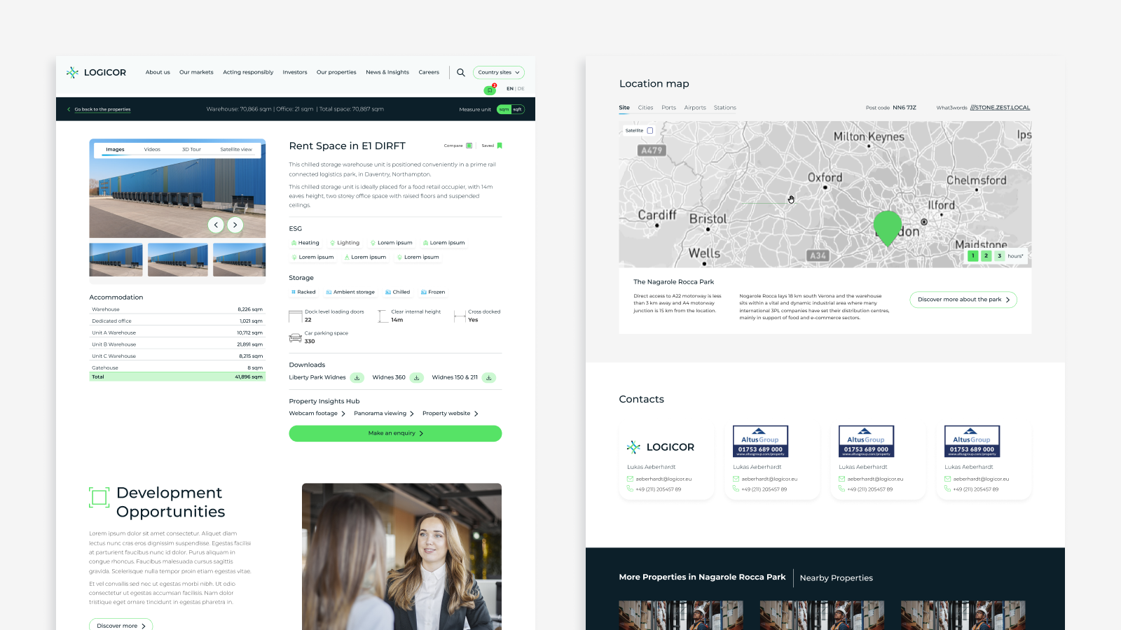
The new property detail page was designed to centralize all relevant information, including various media types, property specifications, facilities, and dimensions. A dynamic map was also integrated, allowing users to explore the property’s location in relation to nearby cities, ports, airports, and stations, enhancing the overall user experience and providing key contextual information.

Property comparison

The team also proposed new business opportunities for Logicor’s business developers by introducing a feature where select properties could be prominently showcased on the site. These featured properties received double the detail views compared to standard listings, providing greater visibility and enhancing potential business opportunities.

Outcomes

The new property map was designed to be user-friendly while staying consistent with Logicor’s rebranding objectives, achieving a balance between aesthetic appeal and functionality. The final design delivered clear, measurable results:

  • The improved property map significantly enhanced user understanding of the property search process.
  • Alignment with Logicor’s rebranding strategy led to increased user engagement and higher satisfaction rates.
  • The clearer, more user-friendly interface resulted in fewer customer support requests related to property searches, indicating that users could navigate and complete tasks more independently.
Design system UI design UX design Website

Logicor: Property Map

  • Date

    October 2, 2023

  • Client

    Logicor

Share project

Post a Comment

Your email address will not be published. Required fields are marked *